
James is central to the design development of a major customer touch point; packaging. And really gets the brand. His eye for detail and design diligence across the briefing process, asset management & generation, adds considerable value to the dept./company. James should take real pride in the role he has played in ensuring that every aspect of the packaging that Whittard produce is an item to cherish and should take heart from the level of trust a great many people across the business place in him.
Danny Burchell
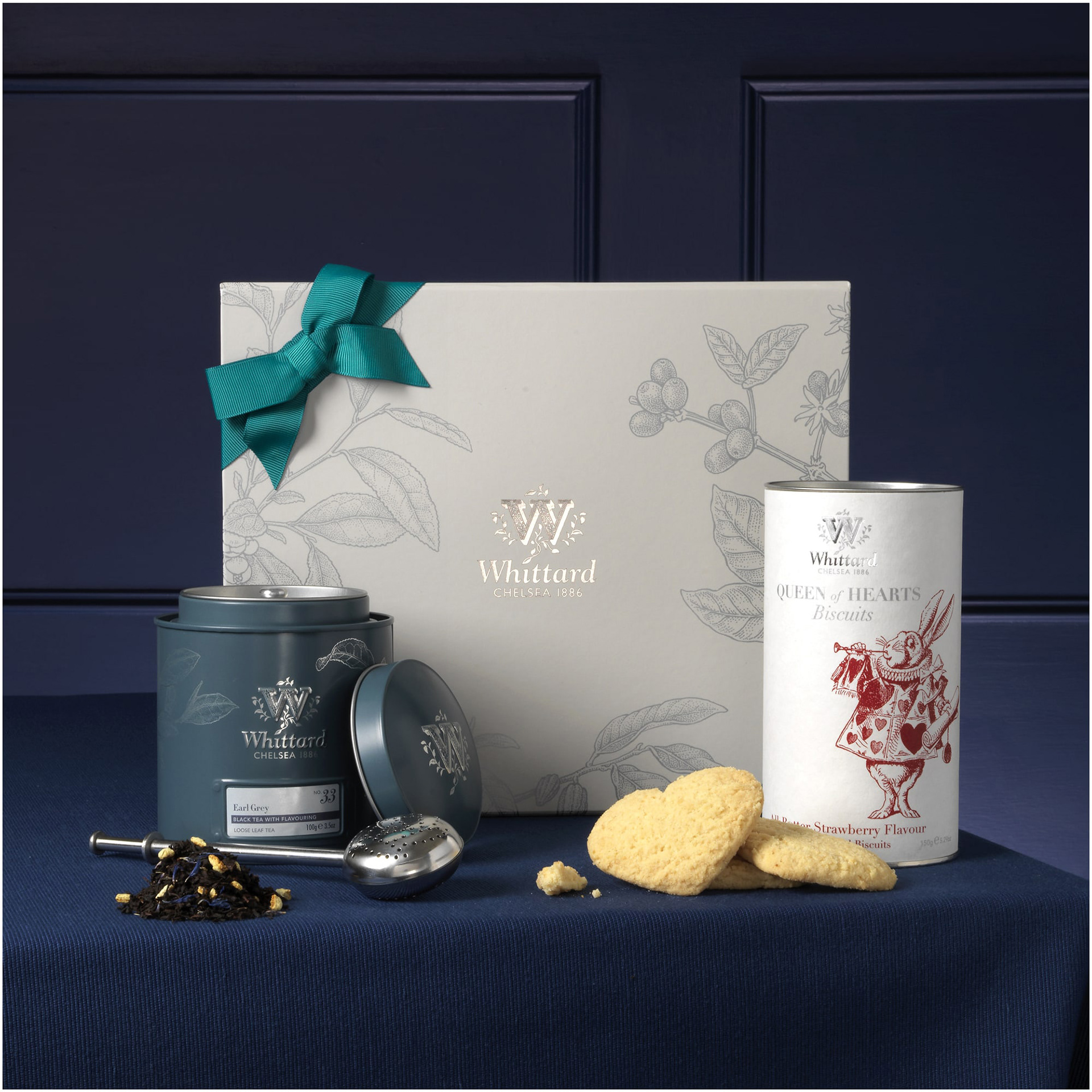
Gifting
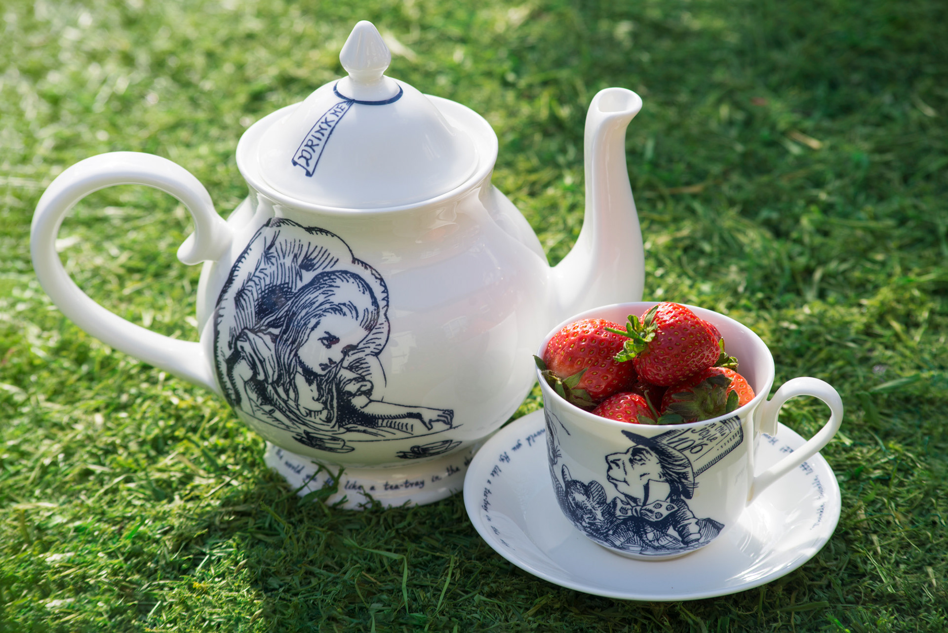
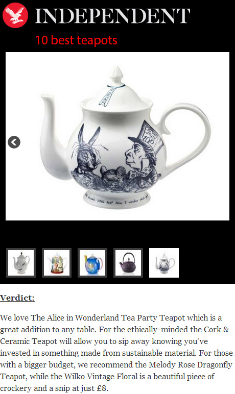
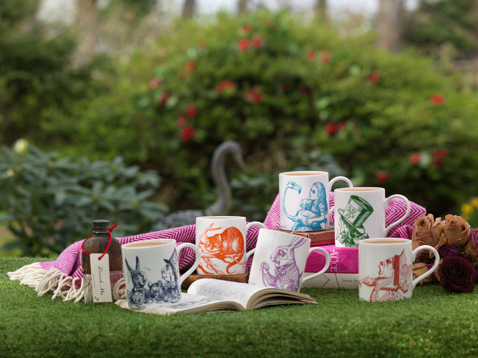
I created new artwork to refresh and extend Whittard’s Alice In Wonderland range of ceramics and gifting. This required me to source and heavily adapt a series of John Tenniel illustrations to transform them into simplified one colour decals on a range of fine bone china mugs. For the teapot 'hero piece', I chose to have an enlarged placement within a lot of space, giving a modern twist to a classic design.
Brand guardianship
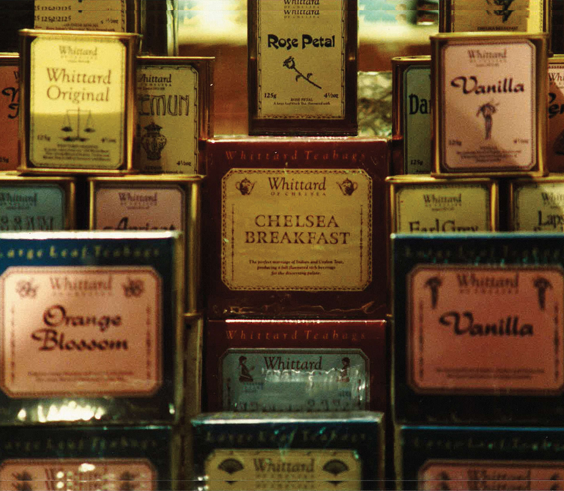
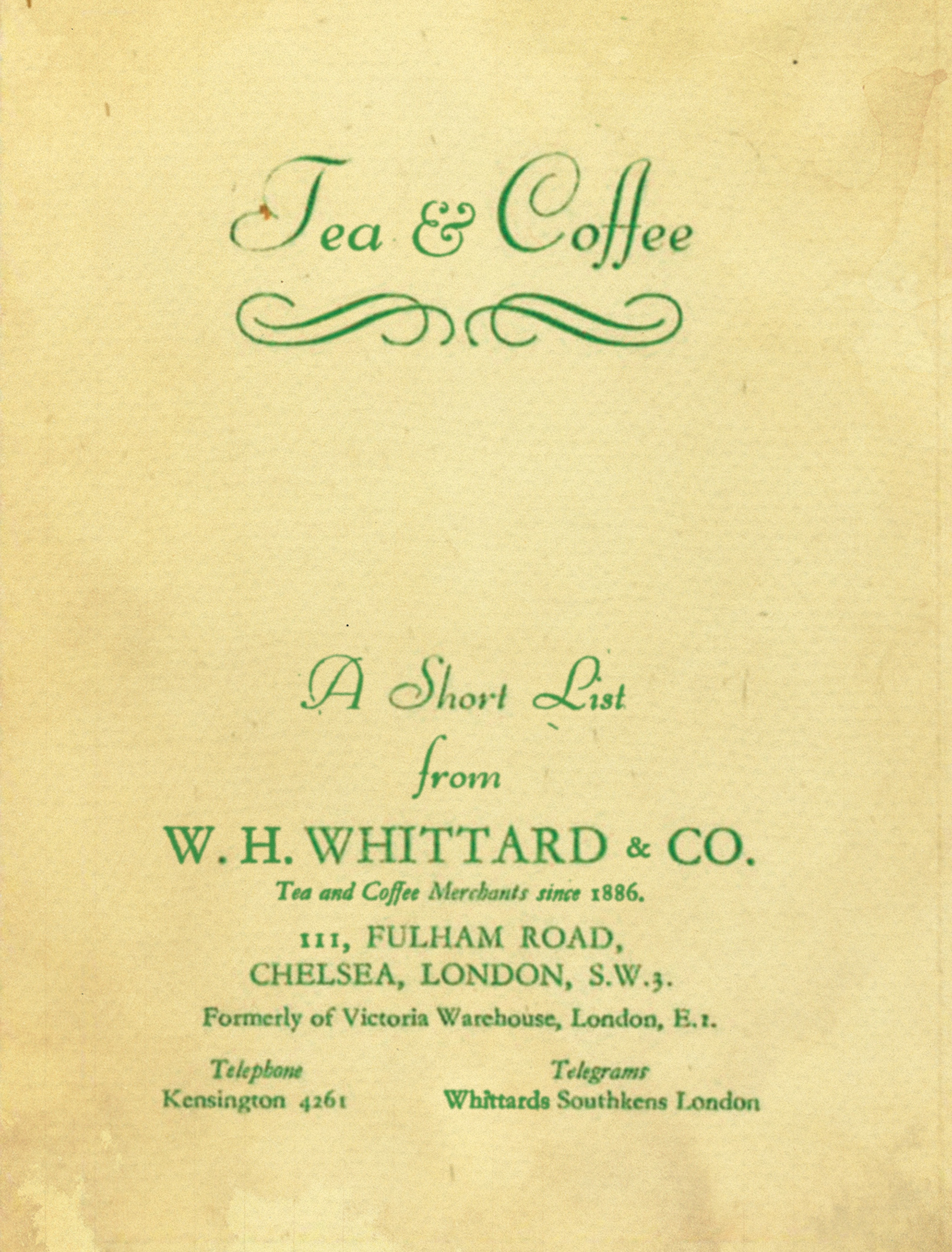
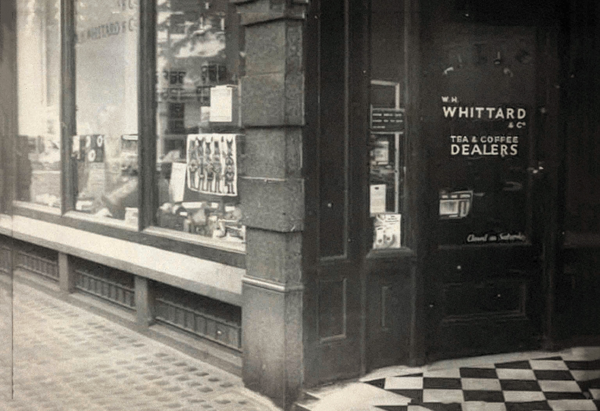
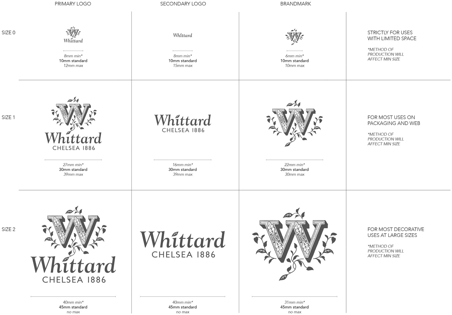
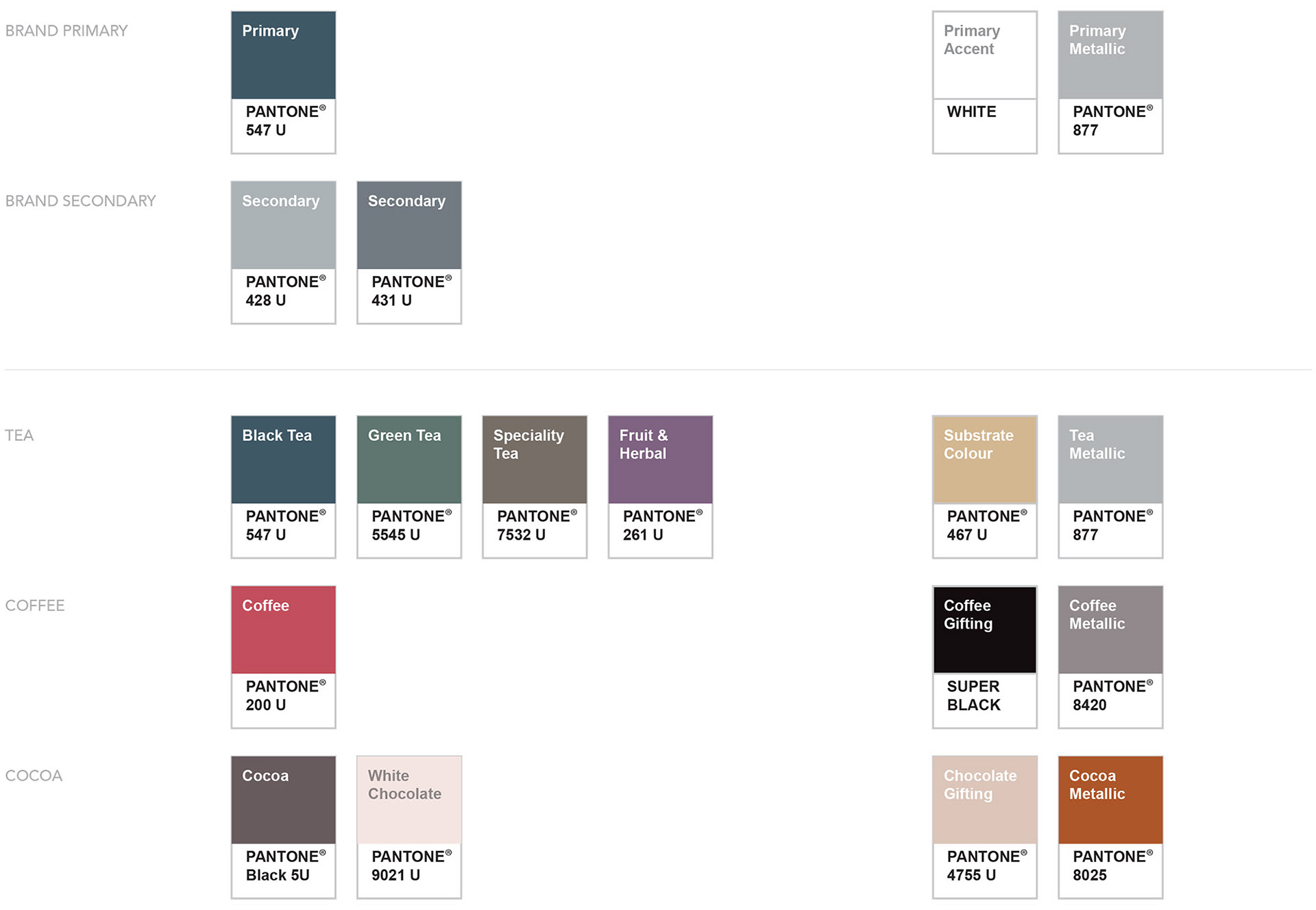
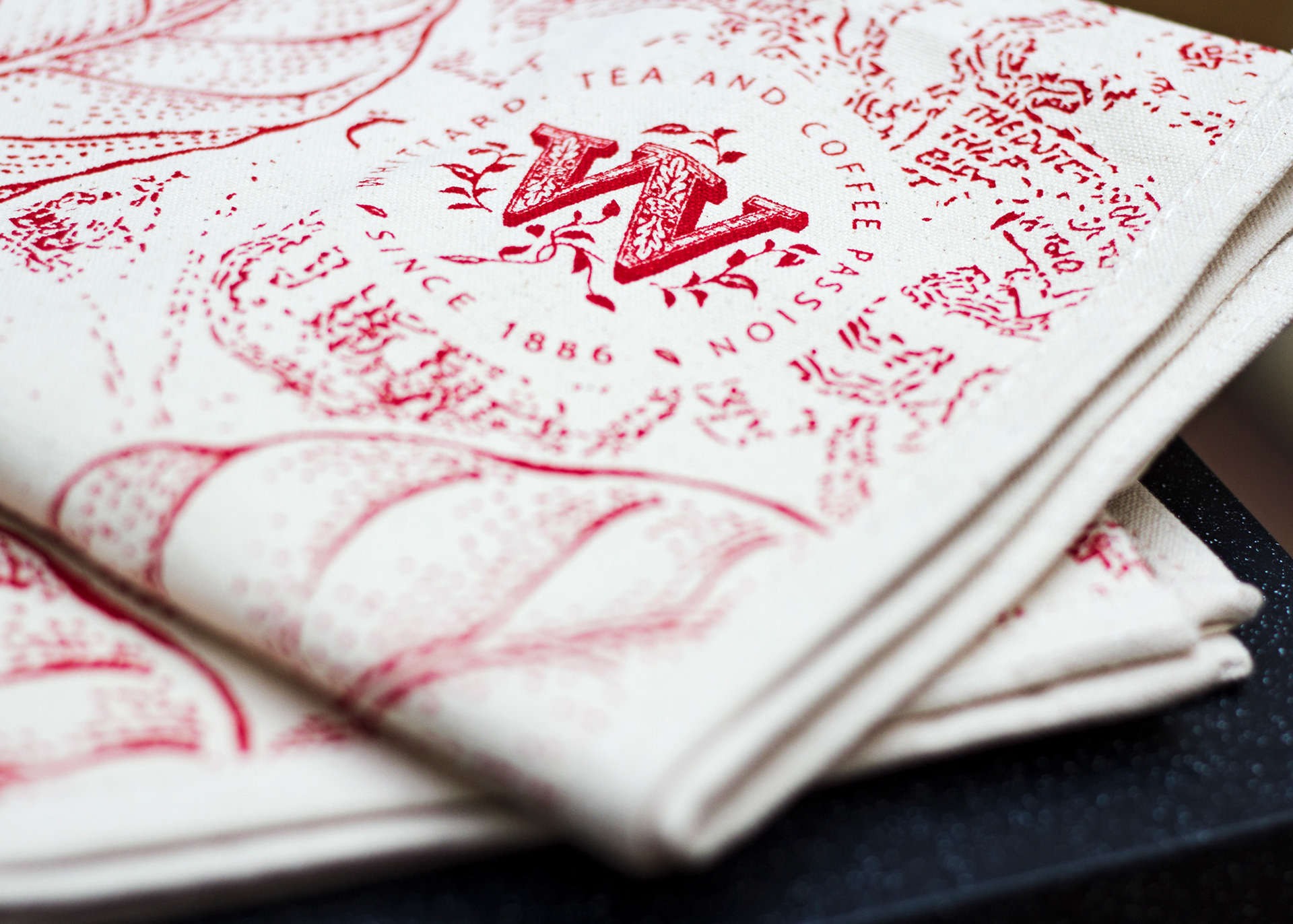
When I started at the company there was very little in the way of brand guidelines or colour schemes. The logo had many variations in current use and new product ranges were developed in silo, often leading to a visually confusing in-store experience. It was my responsibility to curate the historical assets accumulated over the decades, and develop a set of guidelines to dictate the use of the logo, colours and fonts. Whittard have a beautiful marque, but it was often misused at sizes or levels of detail impossible to reproduce successfully. I refined the forms of the logo, and developed three distinct variations with a guide to their appropriate use. I also developed a flexible colour scheme that helped with building cohesive ranges and cross-merchandising.
Product & surface pattern

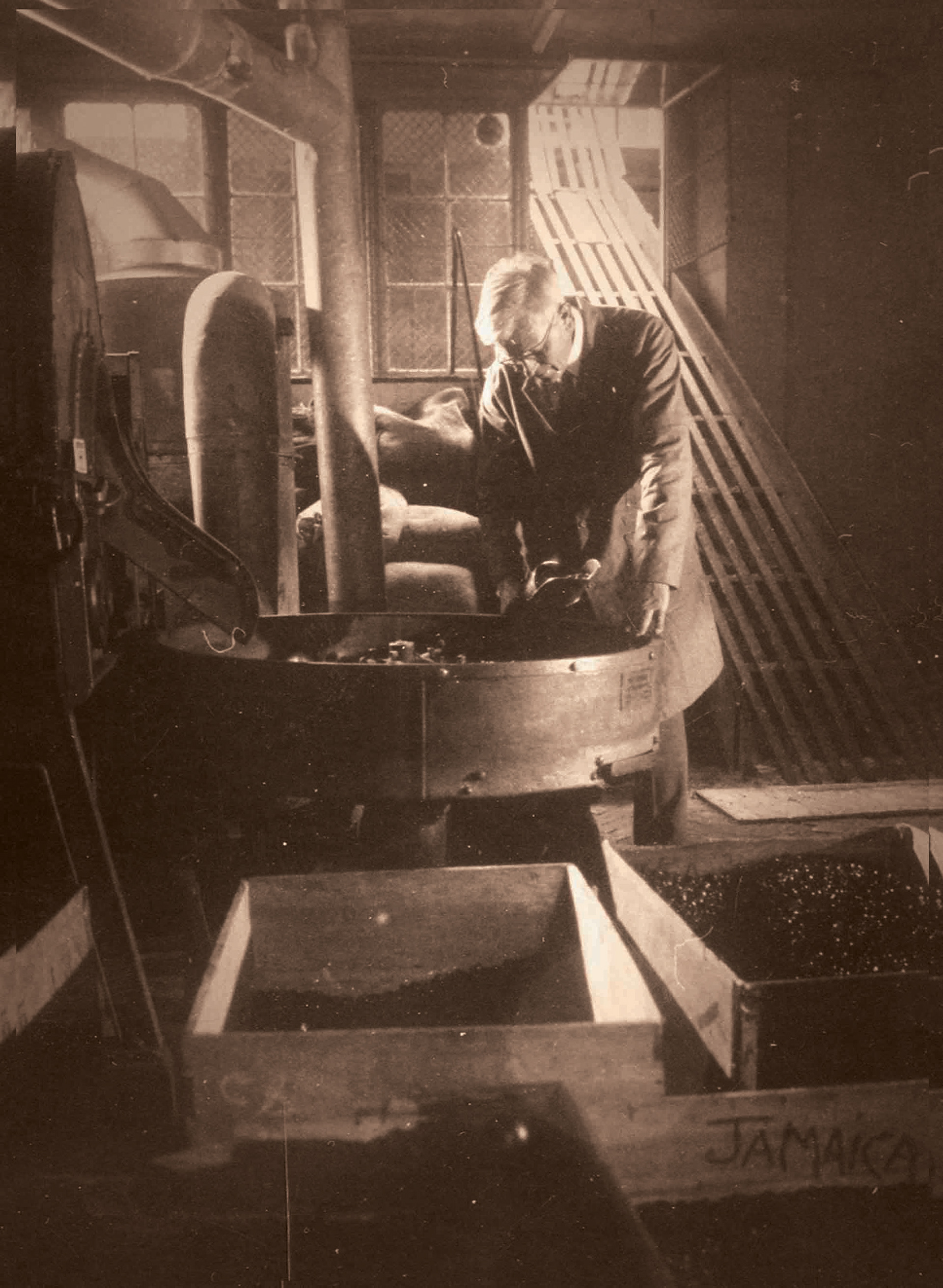
I was responsible for designing and managing the production process of their many ranges of hand painted ceramics. This involved quite trend-driven design projects and then careful implementation and management with the suppliers in Thailand. Sample production was a lengthy and complicated process. I had to be very prescriptive with my briefs and careful with my designs to ensure the end product was deliverable to a high standard and on time.
Range rationalisation


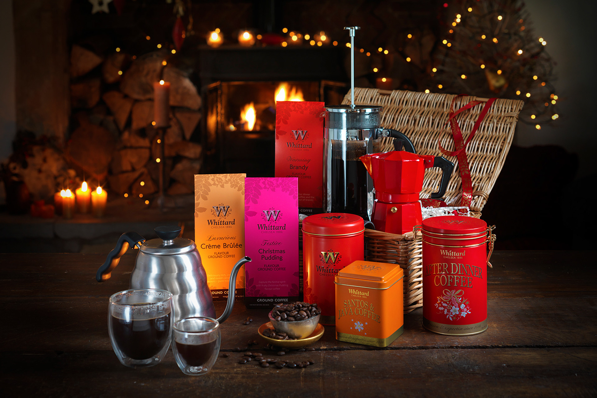
It was always a challenge to develop seasonal products that were successful during the Christmas trading period, but also had greater longevity and coherence within the core product ranges. For the first time in the company's history, we made a conscious departure from an overtly Christmas themed range, and I developed a flexible 'Winter' design that was geared to cross-merchandise with Whittard's three major ranges. The brand's key visual assets - a set of botanical illustrations - were transformed into 'flowerflakes’ which were produced in gold or embossed. This successfully brought these seasonal ‘Winter’ themed gifts and our core products together, making one larger and more legible offering to promote for AW14.

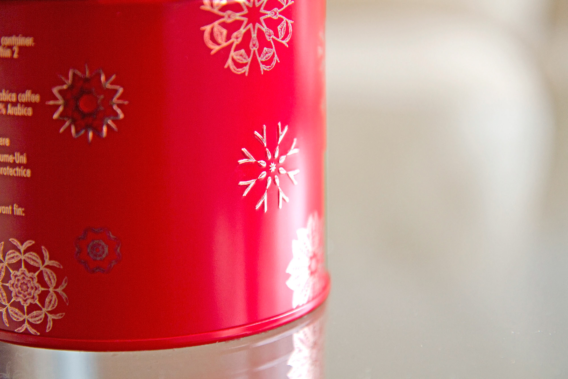

The result was a more sophisticated and paired back range than previous years, but was extremely successful at allowing cross-merchandising in any category, as well as building gifts and hampers. Many confectionery lines were able to be sold well into the new year, which was a key driver for developing a more generic Christmas offering.